Case study 01 · 1970–1989

Herman Miller Picnic Posters

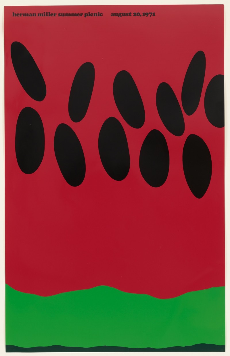
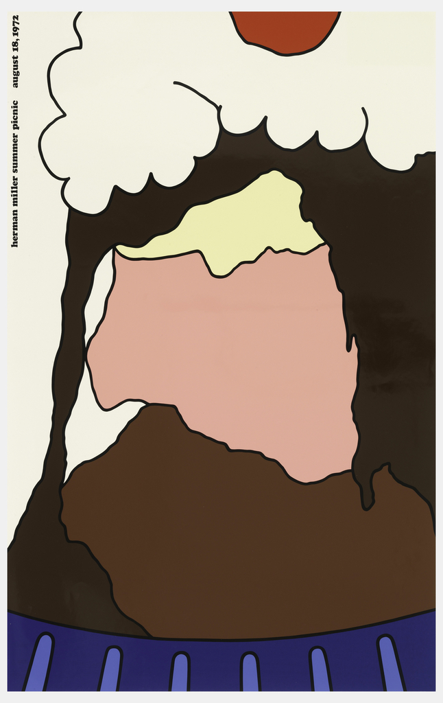
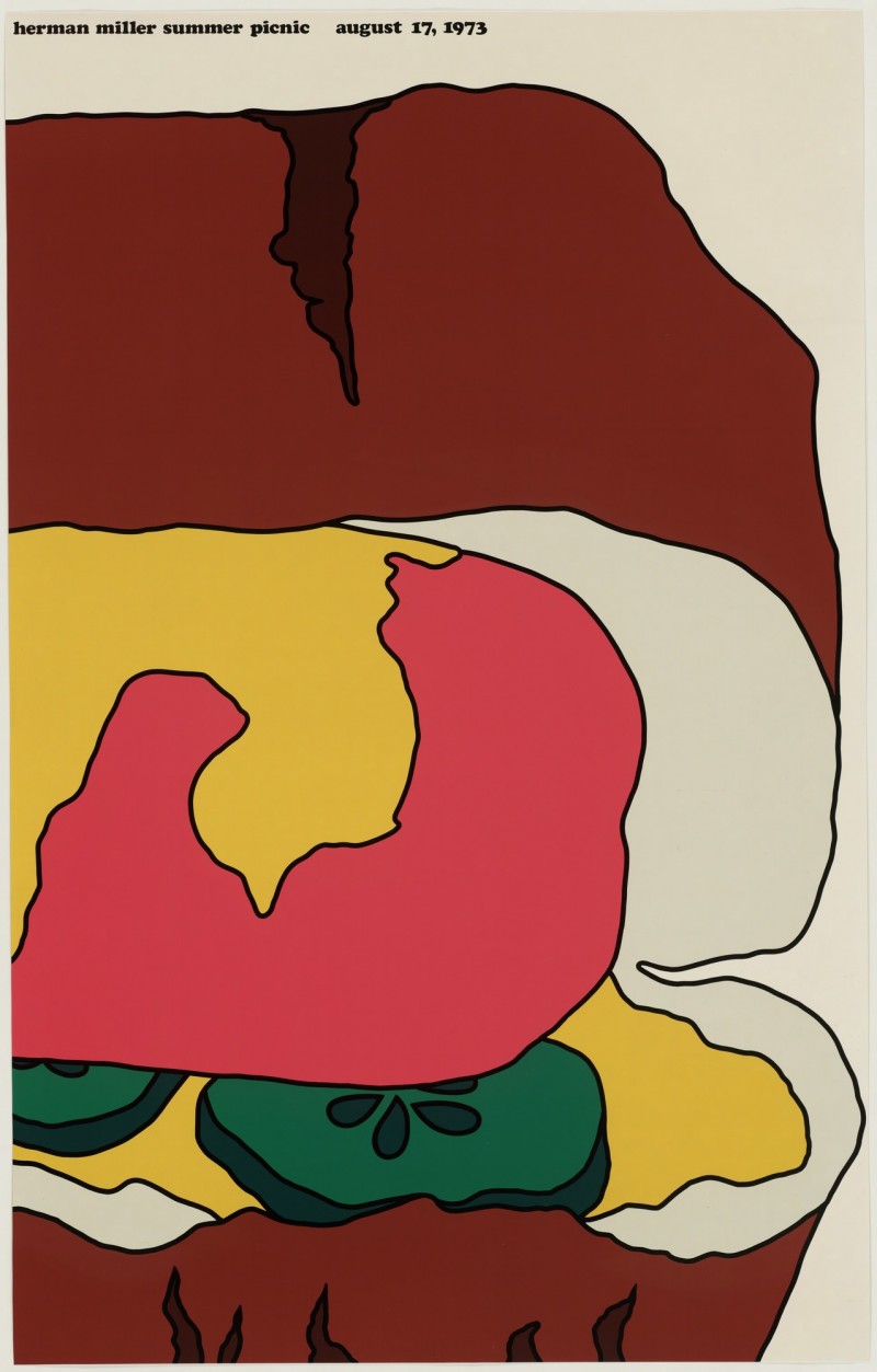
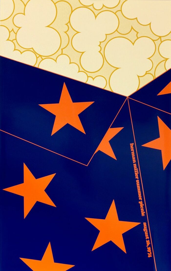
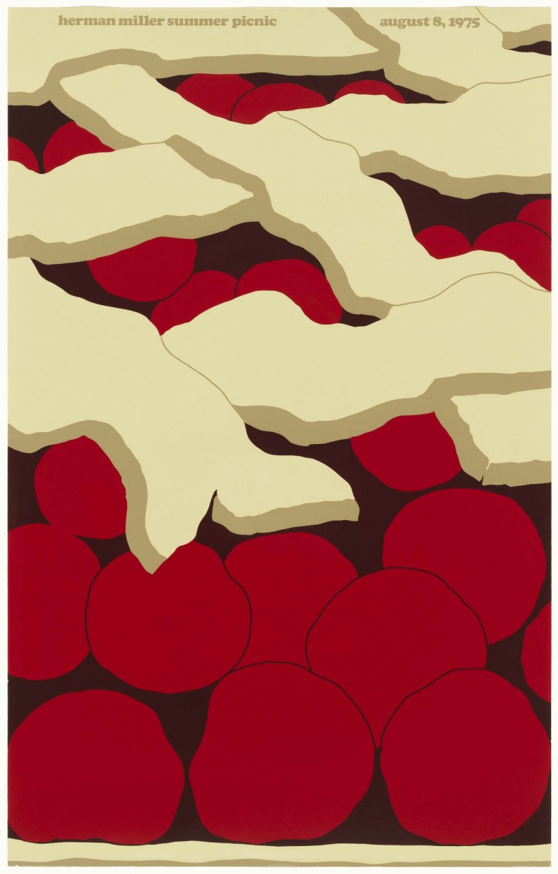
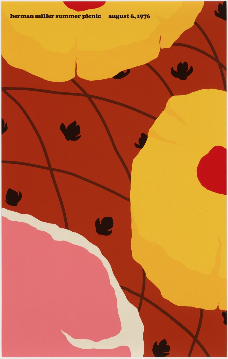
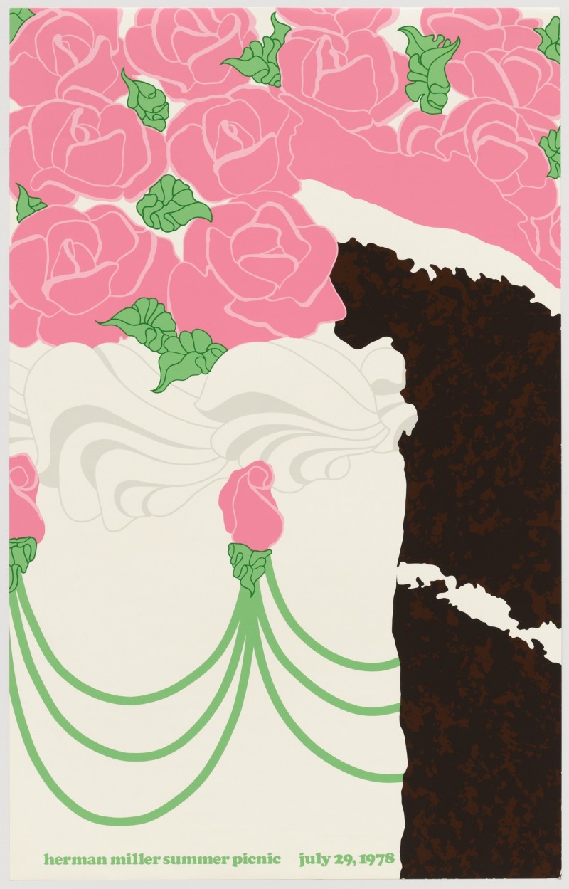
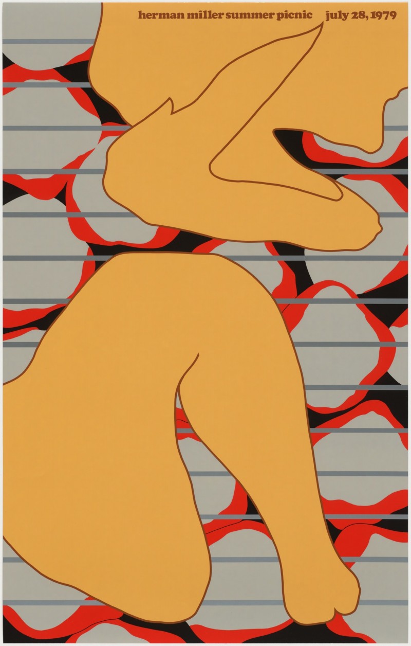
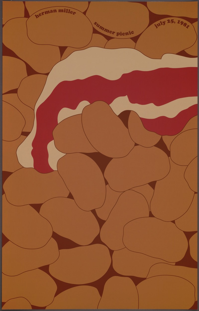
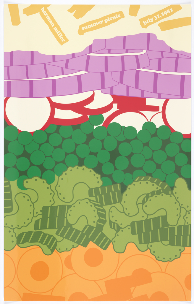
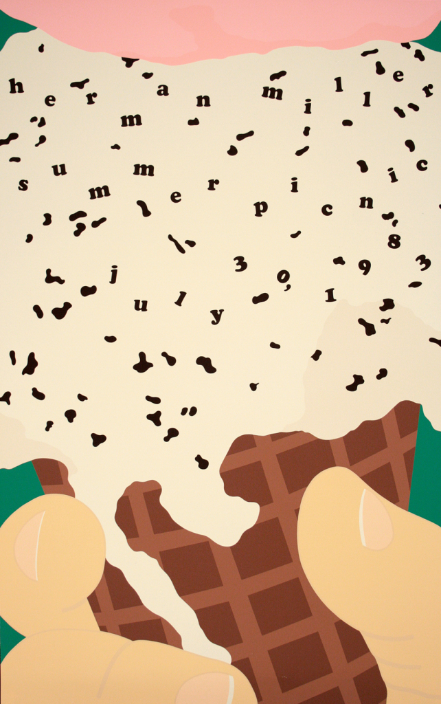
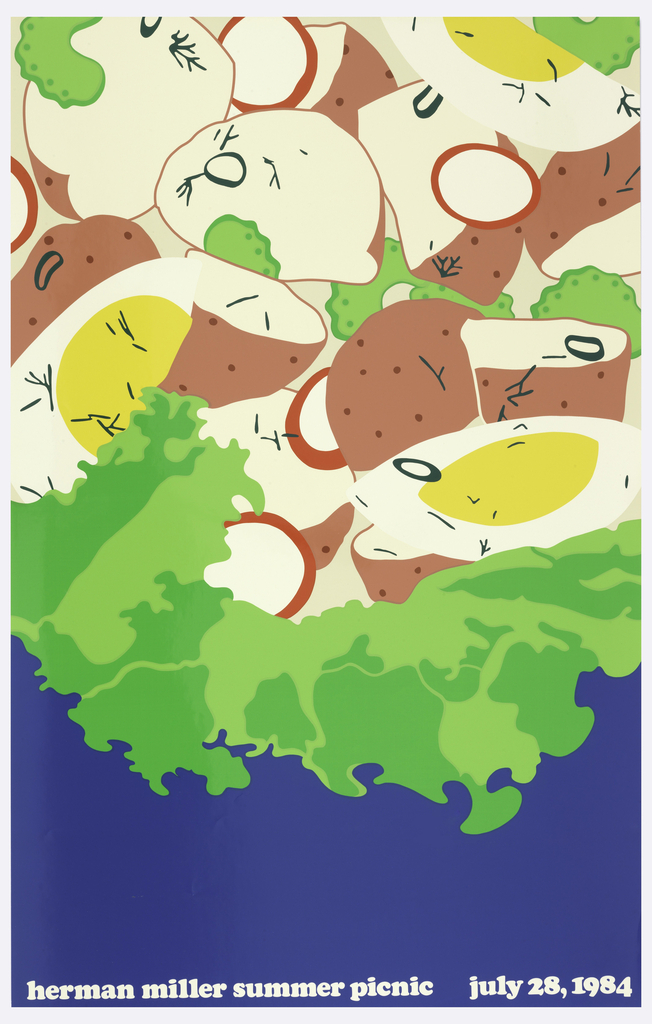
Twenty annual posters designed for Herman Miller’s employee picnic became a dataset for exploring how manual observation and computational analysis reveal different visual properties.

Begin the analysis ↓

Chronology provides the collection’s original order. It shows how the series developed over twenty years, but it does not necessarily reveal which posters are visually related.

Early exploration

1970–1974
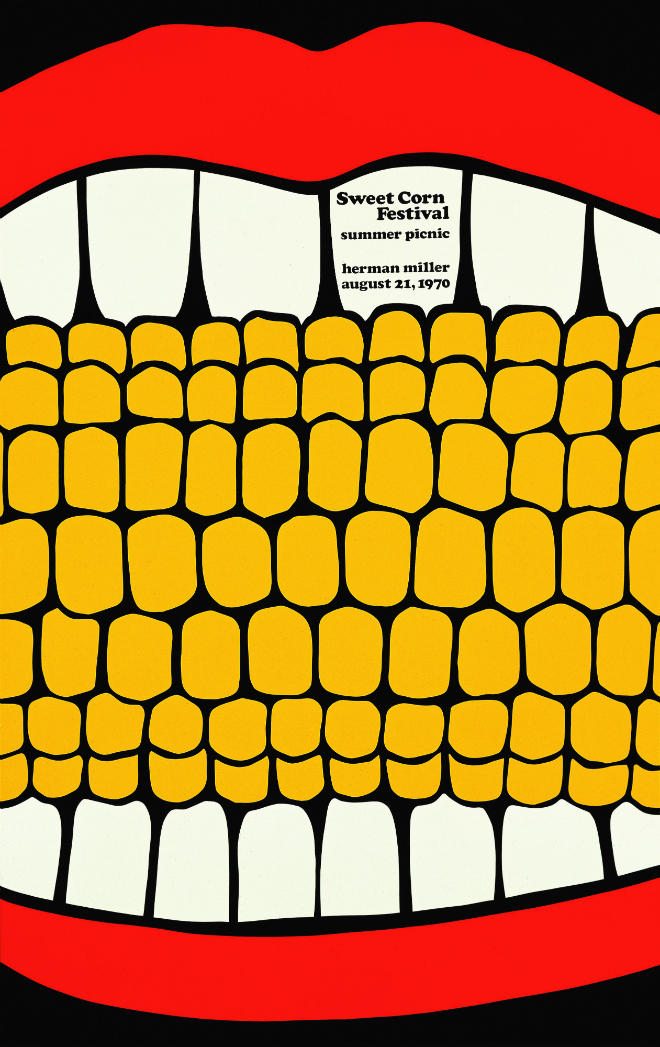
1970
1971
1972
1973
1974

Style development

1975–1979
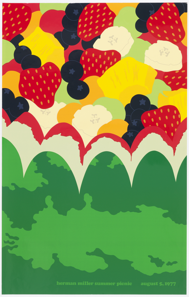
1975
1976
1977
1978
1979

Peak experimentation

1980–1984
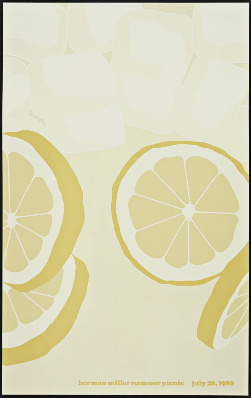
1980
1981
1982
1983
1984

Mature refinement

1985–1989
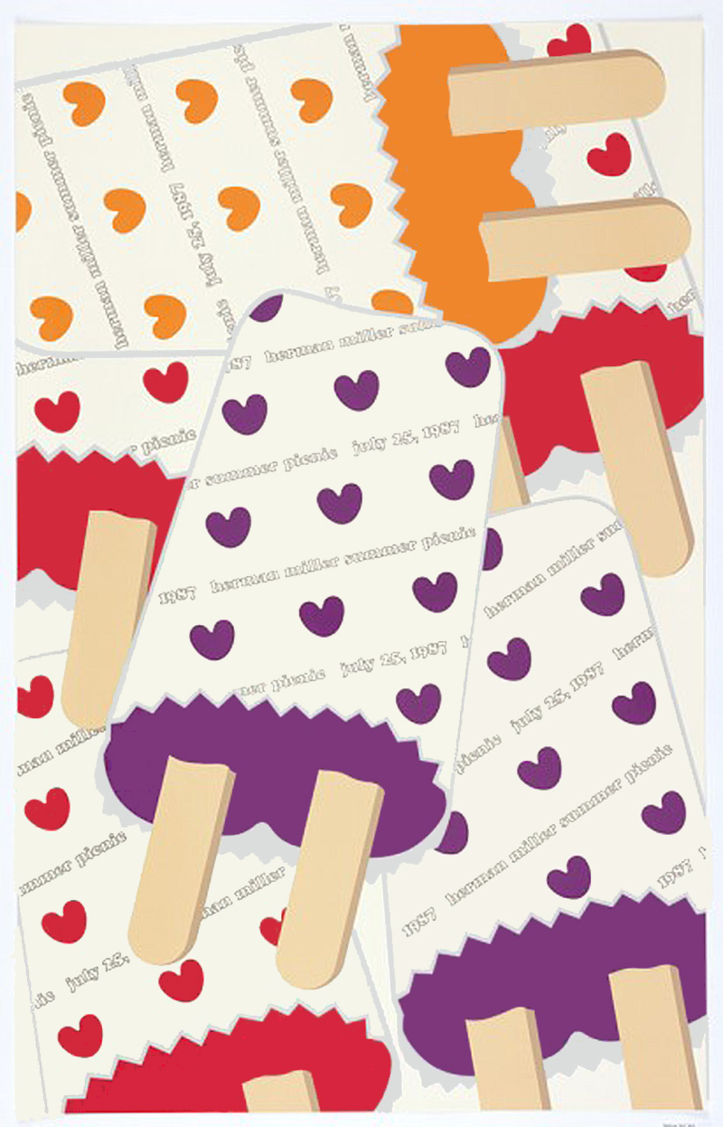
1985
1986
1987
1988
1989

To discover those relationships, the posters need to be removed from the timeline and rearranged according to what they look and feel like.

Perceptual sorting · Structure

Structure → Entropic

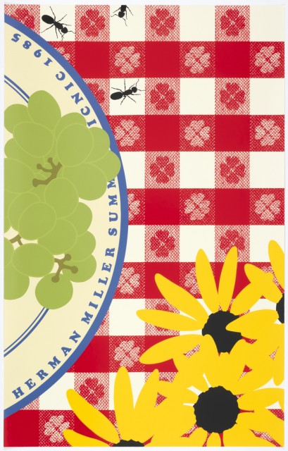
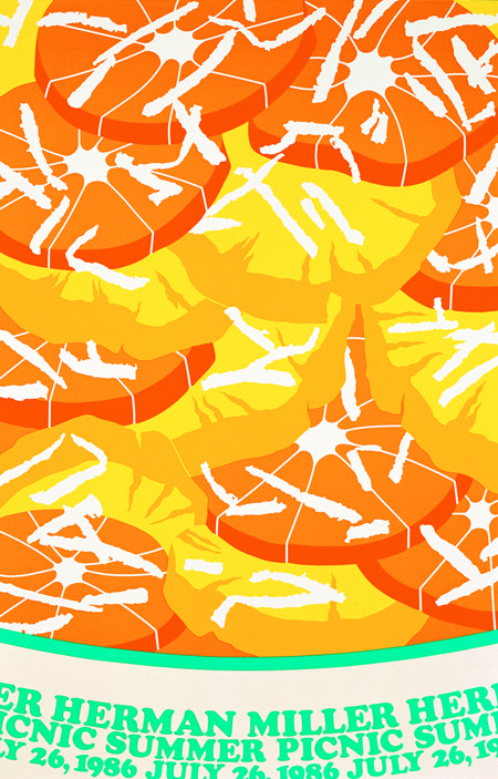
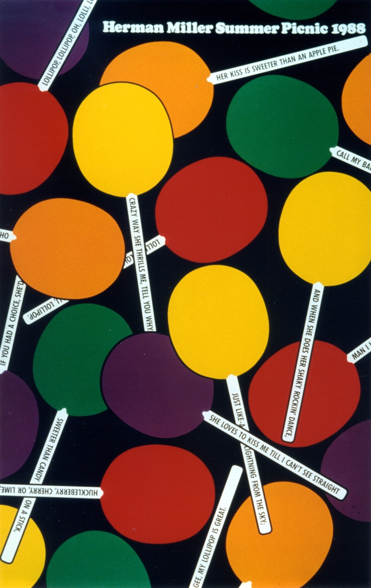
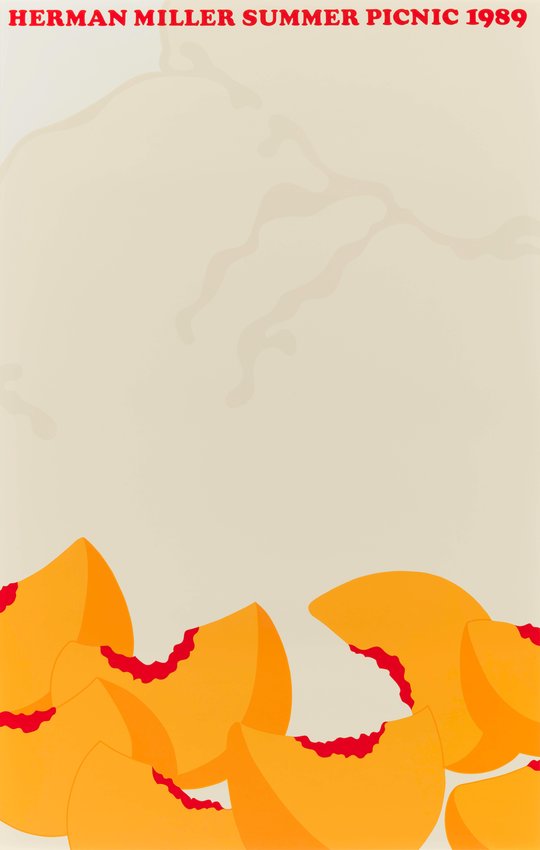
The posters are arranged from controlled, clearly organized compositions to increasingly dense, irregular, and visually unpredictable structures.

1985
1970
1973
1971
1976
1989
1983
1981
1974
1982
1984
1987
1986
1980
1988
1975
1977
1978
1972
1979

Perceptual sorting · Color temperature

Warm → Cool

Structure describes how the elements within a poster are organized, but color creates another kind of relationship. The collection was rearranged according to perceived color temperature, moving from warm reds, oranges, and yellows toward cooler blues, greens, and neutral tones.

1970
1976
1985
1973
1982
1983
1974
1986
1989
1981
1971
1978
1972
1979
1975
1980
1987
1988
1984

This arrangement reveals relationships that chronology obscures. Posters created years apart can share a similar compositional logic, while neighboring years can organize information in very different ways. Structure is only one perceptual dimension, however. Color offers another way to reorganize the collection.

Quantitative analysis · 1970

From Perception to Pixels

Each poster is translated into measurable color data by grouping its pixels into representative color clusters. The area of each circle corresponds to the number of pixels assigned to that color.

1970
34.8%
22.6%
19.9%
18.4%

10 representative RGB clusters extracted from 100,000 analyzed pixels. Bubble area corresponds to pixel count. Hover over a bubble for its RGB value and exact count.

Reading the result

Comparing the measured palette with the perceptual warm-to-cool ordering reveals where pixel distribution supports visual judgment and where it does not. A color may occupy relatively little space while still exerting a strong influence through contrast, position, or saturation.